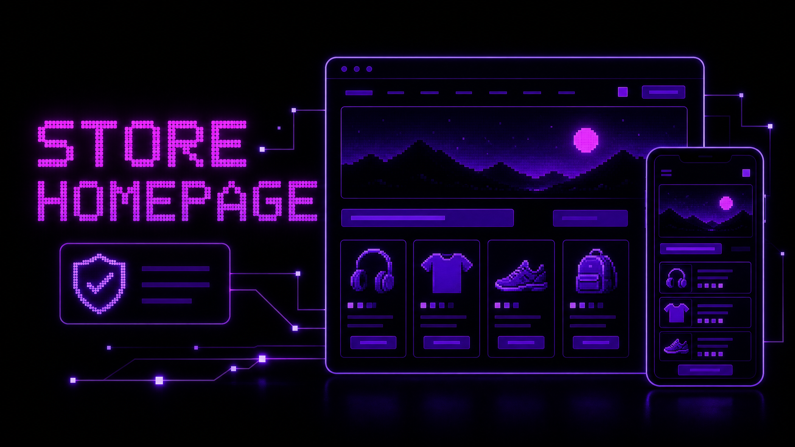
How to Improve an Online Store Homepage
An online-store homepage has a difficult job. It must communicate what the business sells, establish trust, help visitors find the right category, highlight relevant products or offers, and work well on different screens and devices.
The homepage should not be treated as a decorative landing screen. It is a navigation and decision-making surface. Baymard’s public homepage research highlights recurring issues such as unclear product breadth, distracting promotions, poorly implemented carousels, weak search visibility, and unclear click targets.1 Google’s e-commerce guidance also recommends linking pages so Search can understand which categories and products are important.2
Use the following framework to review and improve your store homepage.
1. Clarify what the store sells
A first-time visitor should quickly understand the product range and the type of customer the store serves. Use a clear value proposition near the top of the page rather than relying only on a logo, an abstract slogan, or a large decorative image.
Answer:
- What does the store sell?
- Who is it for?
- What makes the shopping experience useful or distinctive?
- What should a new visitor do next?
A value proposition should be specific enough to guide action. “Products for better living” is difficult to interpret. “Tools and accessories for home coffee brewing” immediately suggests a product range and audience.
2. Make the product range visible
Visitors need to know whether the store carries the type of product they are seeking. Show the main categories or use cases in the primary navigation and on the homepage where appropriate.
Do not attempt to display every category equally if the catalog is large. Group products into clear paths and use representative imagery. Feature important categories based on customer demand, business priorities, seasonal relevance, or strategic products—not only on internal preferences.
The homepage can also link to buying guides or collections that help customers who know their need but not the exact product.
3. Make navigation and search easy to find
The main navigation should use labels that customers understand. Search should be easy to locate, especially when the store has a broad or technical catalog.
On mobile, do not hide essential category access behind an unclear icon or place search where it disappears after the first scroll. Use a visible, accessible control and provide useful empty-state and no-result messages.
The homepage should connect to important categories and products through normal links. Google explains that internal link relationships help it understand site structure and relative importance.2
4. Design a focused hero section
A hero section should communicate one primary message and provide a clear next action. It might introduce the store, highlight a seasonal collection, or direct customers to a key category.
Avoid filling the hero with several competing headlines, small text, multiple buttons, and fast-moving slides. If an image is used, it should support the message and show the product or context clearly. Every promotional image that depicts products should lead to a relevant collection or product page.
A good hero answers “Why am I here?” and “Where can I go next?” without forcing visitors to interpret a visual puzzle.
5. Use promotions with restraint
Promotions can help shoppers discover offers, but excessive banners, pop-ups, countdowns, or autoplay motion create friction. A promotion should have a clear audience, condition, date, and action.
Make the offer truthful and easy to understand. Show exclusions, minimum order values, delivery conditions, or expiration dates where they affect the decision. Do not use false urgency or make it difficult to dismiss an overlay.
Prioritize the action that supports the visitor’s current task. A discount pop-up should not cover the category navigation or block a returning customer from finding a product.
6. Choose useful product imagery
Homepage imagery should communicate product type, scale, use, and quality. A generic stock image may look polished but fail to explain what the store actually sells.
Use consistent image treatment across featured categories and products. Optimize image files for loading speed, provide useful alternative text for informative images, and avoid placing important text only inside an image.
When a visual shows several products, link to the collection or provide clear links to the products depicted. This prevents the image from becoming a dead-end advertisement.
7. Feature products with enough context
Featured product cards should help customers decide whether to explore further. Include the product name, current price, useful variant or availability information, and a clear link to the product page.
Do not fill the homepage with too many similar products. Select a focused group such as best sellers, new arrivals, seasonal products, or products for a specific use case. Explain the selection when the context is not obvious.
Make cards usable on touch screens and ensure the entire intended click area matches the visible design. A small title link inside a large image card can create confusion if users expect the whole card to be interactive.
8. Add trust signals where questions arise
Trust information should appear near the relevant decision, not only in the footer. Depending on the store, useful signals include delivery information, payment options, returns, warranty, support, secure checkout, verified reviews, product certifications, and clear business details.
Trust signals should be real and current. Do not display a badge, rating, or claim that the business cannot substantiate. If customers need to understand a return policy before browsing products, link to it from the homepage and the relevant product pages.
9. Support different visitor paths
Not every visitor begins with the same level of knowledge. Some know the exact product, some know the problem they want to solve, and others are exploring.
Support these paths with:
- Search for known-item shoppers
- Categories for product-type browsing
- Collections for seasonal or curated discovery
- Buying guides for problem-led exploration
- Comparison or filtering tools for complex catalogs
- Customer support for questions that the page cannot answer
A homepage should guide visitors without forcing every person through the same promotional sequence.
10. Design for mobile and accessibility
Review the homepage at narrow widths and with touch input. Check that navigation, search, buttons, forms, banners, images, and carousels remain understandable and usable.
Use semantic HTML, visible keyboard focus, sufficient contrast, descriptive labels, alternative text for informative images, and controls that can be operated without hover. Avoid making motion essential to understanding the page. Respect reduced-motion preferences where animations are used.
Accessibility is not only a compliance concern. It reduces ambiguity and helps more customers complete the same basic tasks.
11. Improve speed and stability
A homepage often loads more media and marketing scripts than any other page. Compress images, serve appropriate responsive sizes, reserve space for media, defer nonessential scripts, and remove components that do not support a clear task.
Test on a mobile device or simulated slower connection. Review the page as it loads: Does content jump? Does a banner appear over the button? Does the menu respond immediately? Does a large video delay access to navigation?
Performance is part of the overall shopping experience, especially for visitors who are still deciding whether the store is worth exploring.
12. Connect the homepage to SEO goals
The homepage should have a descriptive title, a clear primary heading, meaningful copy, and links to important categories and products. Do not use the homepage to target every product keyword; its purpose is to represent the store and direct visitors to more specific pages.
Use descriptive anchor text and a logical navigation structure. Make sure important pages can be reached through links rather than only through an internal search interface. Keep metadata and structured data accurate and consistent with visible content.
13. Measure behavior, not vanity metrics
Define what the homepage should help users accomplish. Useful measures may include category clicks, search use, product-page visits, engagement with featured collections, mobile navigation success, add-to-cart activity from homepage visitors, and support contacts.
Interpret metrics in context. A high click-through rate to a product page is not automatically positive if visitors return because the category link was misleading. A low homepage bounce rate is not enough if customers cannot find products or complete purchases.
Combine analytics with usability observation, search logs, support questions, and customer feedback. Look for recurring friction rather than changing the page based on one day of data.
A simple homepage audit
Open the page as a first-time visitor and write down what you think the store sells, who it serves, and where you would click next. Then test three tasks: find a category, find a specific product, and locate delivery or return information.
Repeat on a phone and with keyboard navigation. Check the first screen, menu, search, hero action, promotional modules, featured product cards, page speed, and footer links. Record each issue with its customer impact, evidence, recommended fix, and priority.
Conclusion
An effective online-store homepage gives visitors a clear reason to continue, a simple way to browse, reliable product context, visible trust information, and an experience that works across devices. The goal is not to place every message on one page. The goal is to help the right visitor reach the right category or product with less uncertainty.
If you need help improving your online-store homepage, navigation, product discovery, or e-commerce SEO, contact Muhammad Rutaab Ali to discuss a practical review.
Related articles
- How to Organize Product Categories for Better SEO and User Experience
- E-commerce Product Page Checklist: 15 Things Every Store Needs
- Common SEO Mistakes on Online Stores
- How to Build a Fast and Responsive Business Website