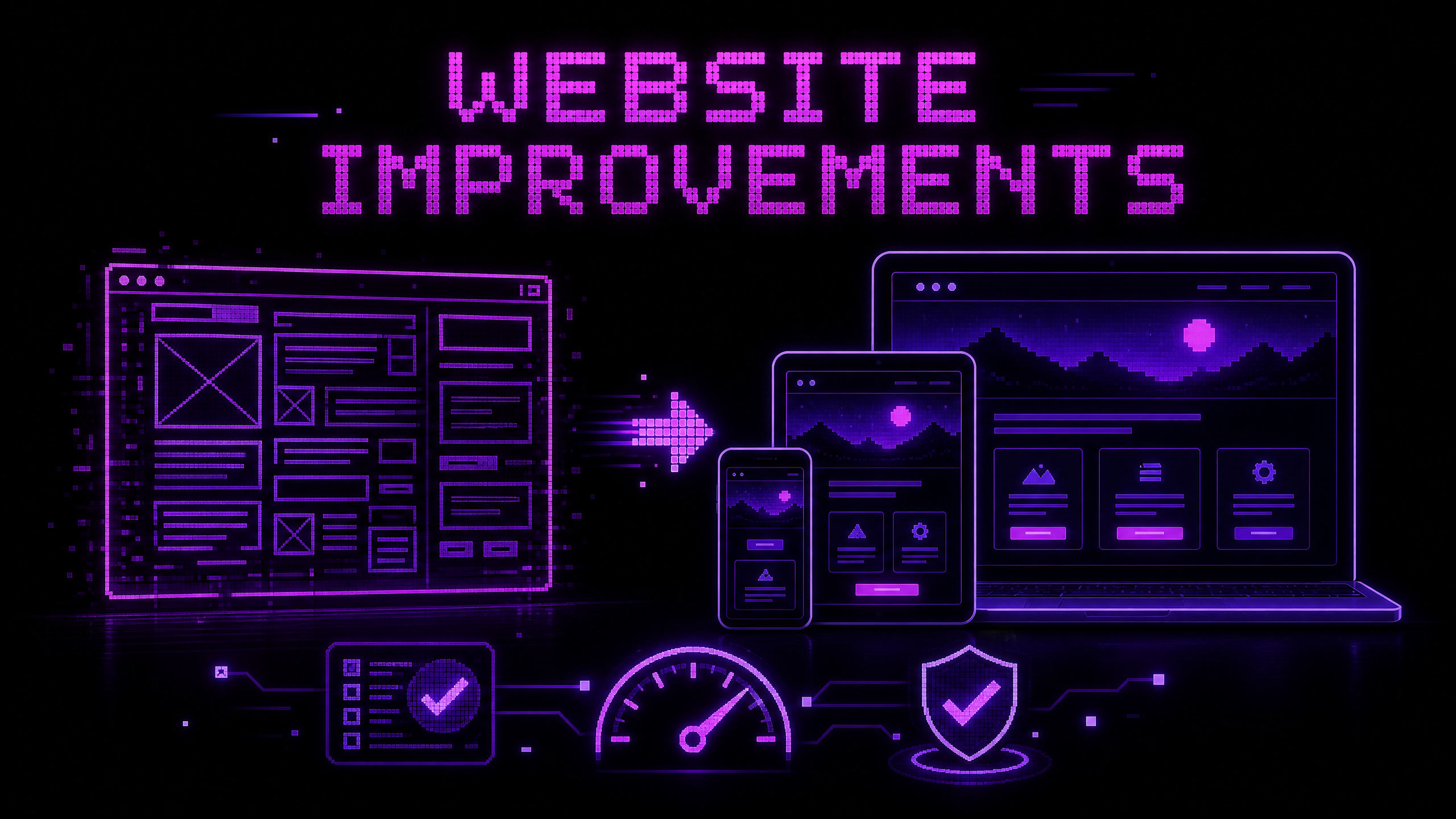
Before and After: How Website Improvements Can Make a Business Look More Professional
A professional website is not simply a website with expensive colors, large animations, or a fashionable typeface. Professionalism is communicated through many small decisions: whether the page is easy to understand, whether information is accurate, whether buttons behave as expected, whether the layout works on a phone, and whether the business makes its next step clear.
A before-and-after improvement process should therefore evaluate both appearance and experience. A page can look attractive and still be confusing. A page can be visually simple and still feel trustworthy because it communicates clearly and works reliably.
This guide explains how I evaluate the most important improvement areas without inventing traffic, conversion, or revenue results. When measured data is unavailable, the before-and-after comparison should describe observable changes and recommend how to test their effect after launch.
What makes a website look professional?
| Area | Professional signal | Common warning sign |
|---|---|---|
| Clarity | Visitors understand the business quickly | Vague headline or unclear service |
| Hierarchy | Important information receives appropriate emphasis | Every section looks equally important |
| Consistency | Colors, spacing, buttons, and typography follow a system | Each section appears designed separately |
| Usability | Navigation and tasks are predictable | Visitors must guess what to click |
| Responsiveness | Content works across screen sizes | Horizontal scrolling or cramped controls |
| Accessibility | More people can perceive and operate the site | Missing labels, weak contrast, or keyboard barriers |
| Performance | Pages respond without unnecessary waiting or movement | Oversized assets and layout shifts |
| Trust | Claims, projects, contact details, and policies are specific | Unsupported promises or missing information |
1. Start with the content hierarchy
Nielsen Norman Group defines visual hierarchy as arranging page elements so the eye is guided through them in the intended order of importance.1 This is one of the fastest ways to improve a visually busy page.
Before changing colors or adding animation, write down the page’s main purpose. For a service business, the visitor may need to understand:
- What the business does
- Who it helps
- Why it is credible
- What action to take next
The page should make those priorities visible. A strong hierarchy often includes a clear headline, supporting explanation, primary call to action, evidence or services, and a way to contact the business.
Before
- Several large headings compete for attention.
- The headline describes the technology but not the customer’s problem.
- Buttons use different labels for the same action.
- Decorative elements are more prominent than the service explanation.
- Important contact information is difficult to find.
After
- One primary headline explains the value or service.
- Supporting text gives useful context.
- One primary action is visually clear.
- Secondary actions are available but less dominant.
- Project evidence and contact information appear in a predictable sequence.
Do not make every element bold, bright, oversized, or animated. If everything is emphasized, the page has no emphasis.
2. Improve spacing and grouping
Whitespace is not empty space that needs to be filled. It helps users understand which elements belong together and where one section ends.
Use smaller spacing between a heading and the content it introduces. Use larger spacing between separate topics. Group related form fields, service details, or product information with consistent alignment and visual boundaries.
Practical spacing review
- Are headings close enough to the content they describe?
- Are unrelated sections visually separated?
- Do cards have consistent internal padding?
- Do buttons have enough space around their labels?
- Does the page feel crowded on a small screen?
- Are line lengths comfortable to read?
A consistent spacing scale often makes a design feel more deliberate even before the visitor can explain why.
3. Use a small, purposeful visual system
Professional design usually has rules. Define a limited color palette, type scale, spacing scale, border style, radius style, and button treatment.
Nielsen Norman Group recommends using color and contrast purposefully, limiting unnecessary contrast variations, and not relying on color alone to communicate hierarchy.1
For a dark portfolio or developer-focused site, a system might include:
- A dark base background
- One primary accent color
- One supporting accent used selectively
- A high-contrast text color
- A muted text color for secondary information
- One clear treatment for primary buttons
- A consistent card and border style
The exact colors are less important than their relationship and use. An accent color should not appear on every element, or it will stop signaling importance.
4. Make navigation predictable
A visitor should be able to answer three questions quickly: Where am I? What else can I explore? How do I take the next step?
Improve navigation by:
- Using descriptive labels
- Keeping the main navigation consistent
- Grouping related pages
- Making the current location understandable
- Linking logos to the homepage where expected
- Providing a visible path to contact or inquiry
- Avoiding labels that sound creative but do not explain their destination
For a portfolio, useful top-level sections may include About, Services, Projects, Blog, and Contact. If a section is important enough to support a decision, it should not be hidden behind unnecessary interaction.
5. Design for mobile before polishing desktop
Responsive design means adapting layout to users’ needs and device capabilities. web.dev recommends a viewport meta tag, avoiding horizontal overflow, sizing images within the viewport, reserving space for images, and using flexible layout systems such as Flexbox, Grid, and media queries.2
Before
- The desktop layout is squeezed onto a phone.
- Text becomes too small to read.
- Cards overflow horizontally.
- Buttons are too close together.
- Decorative animation competes with the main content.
- Navigation is difficult to open or close.
After
- The content reflows into a readable single-column or narrow layout.
- Images shrink within the available width.
- Buttons remain large enough to operate comfortably.
- Sections keep their order and meaning.
- The primary action remains visible without overwhelming the page.
- Touch interaction is considered rather than relying only on hover.
Do not choose breakpoints only because a device has a popular screen width. Let the content determine when the layout needs to change.
6. Improve typography and readability
Typography affects both visual hierarchy and comprehension. A professional site should make body text easy to read and headings easy to scan.
Review:
- Body-text size and line height
- Contrast between text and background
- Heading scale and order
- Line length on desktop
- Spacing between paragraphs
- Link visibility
- Font loading behavior
- Text inside buttons and cards
Avoid using all caps for large amounts of content. Avoid placing long paragraphs over busy images. Use font weight and size to establish hierarchy, not a collection of unrelated styles.
A visually impressive display font can work for a short headline, but the main content should prioritize readability.
7. Build accessibility into the improvement
W3C’s WCAG 2.2 describes accessibility through four principles: content should be perceivable, operable, understandable, and robust.3 The guidelines include testable success criteria and can be applied across desktop, mobile, and other devices.
A before-and-after accessibility review can include:
| Before problem | Improvement |
|---|---|
| Low text contrast | Use a contrast-checked color combination |
| Color is the only error signal | Add text, icons, or clear descriptions |
| Images lack useful alternative text | Describe informative images; mark decorative images appropriately |
| Form controls lack labels | Connect visible labels to controls |
| Keyboard focus is invisible | Provide a visible focus style |
| Custom controls are difficult to operate | Use semantic controls or implement keyboard behavior correctly |
| Headings are chosen for appearance only | Use a meaningful heading structure |
| Animation cannot be reduced | Respect reduced-motion preferences where appropriate |
Automated checks are useful, but they do not replace keyboard testing, content review, or testing with people who use assistive technology.
8. Make performance part of professionalism
A slow website can make a business feel less reliable, especially when visitors are trying to read services, inspect projects, or submit a form.
Common improvement opportunities include:
- Resize and compress images
- Use responsive image sources
- Remove unused scripts
- Delay nonessential work
- Reduce layout movement by reserving media space
- Review third-party embeds
- Use appropriate caching and hosting settings
- Measure representative pages rather than only the homepage
Performance should be evaluated with both tools and real usage. A lab test can help locate a technical bottleneck, while field data or user feedback can show whether the experience improves under actual conditions.
9. Replace vague claims with evidence
Professional websites make it easier to believe what they say. Replace unsupported claims such as “the best developer” or “guaranteed results” with specific evidence.
Useful evidence may include:
- A clear description of your role
- Technologies used
- A project goal
- A process explanation
- Screenshots or live links
- A client-approved testimonial
- A documented before-and-after improvement
- A clear service scope
- Relevant certifications or experience, when accurate
If you do not have measured business outcomes, do not invent them. You can still explain what changed: navigation was simplified, the layout became responsive, product information was clarified, or a technical issue was resolved.
10. Improve calls to action
A call to action should describe the next step and match the visitor’s readiness. “Contact me” may be appropriate for a portfolio, while “Review the project” or “Read the case study” may be better for someone still evaluating your work.
Use a clear primary action and meaningful secondary actions:
Primary: Discuss your website project
Secondary: View recent work
Informational: Read the development process
Check that each button:
- Has a clear label
- Looks interactive
- Has a visible focus state
- Works with a keyboard
- Leads to the promised destination
- Remains usable on mobile
11. Before-and-after evaluation without invented results
A responsible case study separates observable changes from measured outcomes.
Observable improvement
The original page had several competing headings. The revised page uses one primary headline, a short supporting explanation, and one prominent contact action.
Measured outcome
After a defined testing period, the page’s form-completion rate changed from one measured baseline to another measured result.
Do not present the first statement as proof of the second. Design improvements may create a better foundation, but their business effect needs measurement.
Useful measurements can include:
- Task-completion success
- Time required to find contact information
- Form completion rate
- Mobile error reports
- Largest Contentful Paint, Interaction to Next Paint, and Cumulative Layout Shift
- Search impressions and clicks
- Scroll depth, where meaningful
- Qualified inquiries
- Customer feedback themes
Define the baseline, time period, page version, traffic source, and event definition before comparing results.
12. A practical before-and-after audit
Use this process when improving an existing website:
- Identify the page’s main business and user goal.
- Capture the current page on desktop and mobile.
- Record the current links, forms, metadata, and key performance observations.
- Ask a first-time user to complete the main task.
- List problems by impact, not by visual annoyance alone.
- Create a hierarchy and content plan.
- Apply a small visual system.
- Fix mobile layout and accessibility barriers.
- Optimize heavy assets and unnecessary scripts.
- Improve trust evidence and calls to action.
- Test the revised page with tools and people.
- Deploy through a preview environment before production.
- Measure meaningful outcomes after launch.
Conclusion
Making a website look more professional is not about adding decoration until the page feels expensive. It is about making the page clearer, more consistent, easier to use, more accessible, faster to load, and more credible.
The strongest before-and-after improvements are often practical: a clear headline, better grouping, a responsive layout, readable typography, accessible controls, optimized images, accurate evidence, and a direct next step.
If you want to improve the design, usability, performance, or search readiness of a business website, contact Muhammad Rutaab Ali to discuss the current experience and the most important next improvement.
Related articles
- How to Build a Fast and Responsive Business Website
- 10 Common Website Problems That Make Visitors Leave
- How to Create a Search-Friendly Website Structure
- My Favorite Tools for Web Development and SEO